

Love Medicine: A Healing Art
L to R Clockwise: John Graham-Pole aged 2 on Mummy’s knee with sisters Elizabeth, Mary, and Jane, High Bickington, Devon,
Posted by Dorothy Lander: dorothy@tryhealingarts.ca
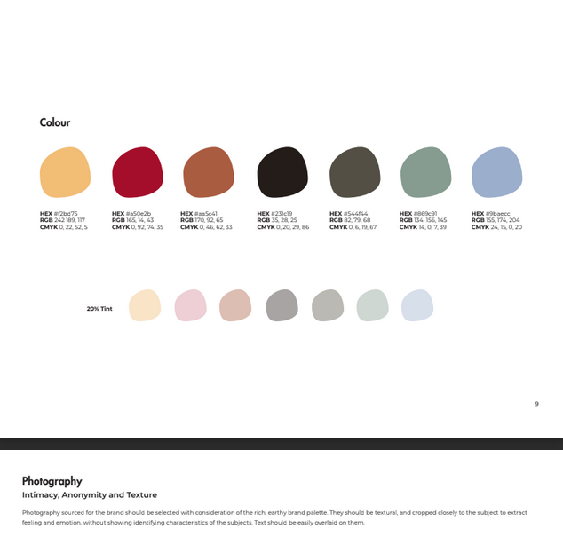
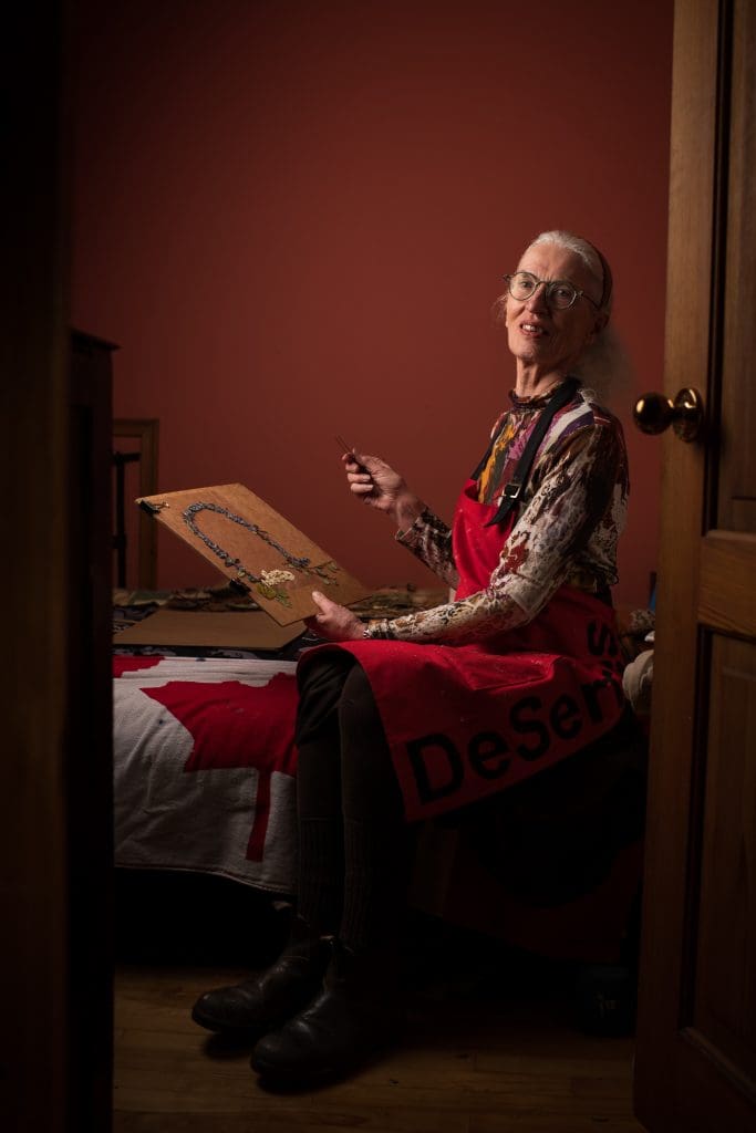
The talented team at This is Marketing (https://www.thisismarketing.ca/) chose a unique colour palette to illuminate the HARP brand. The TiM team instructed Dorothy Lander and John Graham-Pole to scour their wardrobe for these colours during the photoshoot in our home as part of creating the new website of HARP The People’s Press (www.tryhealingarts.ca). I managed to come up with eight wardrobe changes!! Including this one—my favourite—thanks to the genius of John David Photography ((https://johndavidphotography.ca/). John David introduced me to his lighting technique based on the Rembrandt triangle – how could I have missed this in my undergraduate concentration in art history over 50 years ago?

I began to see HARP’s colour palette everywhere. And then THIS!
My good friend Darlene Rushton and I eagerly attended The Curated Collective Clothing Sale hosted by Emilie Chiasson and Erin Thomasen.




This cashmere sweater flew off the hanger at me. A new label for me – Cashmere and Cupcakes https://cupcakesandcashmere.com/ My experience with TiM has me taking a closer look at branding.
Full disclosure: Before TiM, the very idea of HARP as a brand had not entered my consciousness. I’ll get it the next time the HARP colour palette reaches out and grabs me.


L to R Clockwise: John Graham-Pole aged 2 on Mummy’s knee with sisters Elizabeth, Mary, and Jane, High Bickington, Devon,

Posted by Dorothy Lander Once a month, John Graham-Pole and I showcase the publications of HARP The People’s Press at


Aboriginal Rock Mural Kimberley Region, Western Australia Posted by John Graham-Pole I don’t have answers to any of these questions,


HARP The People’s Press released the podcast series Estuary and Piping Plover Find Their Voice to mark two momentous occasions:
| Cookie | Duration | Description |
|---|---|---|
| cookielawinfo-checkbox-analytics | 11 months | This cookie is set by GDPR Cookie Consent plugin. The cookie is used to store the user consent for the cookies in the category "Analytics". |
| cookielawinfo-checkbox-functional | 11 months | The cookie is set by GDPR cookie consent to record the user consent for the cookies in the category "Functional". |
| cookielawinfo-checkbox-necessary | 11 months | This cookie is set by GDPR Cookie Consent plugin. The cookies is used to store the user consent for the cookies in the category "Necessary". |
| cookielawinfo-checkbox-others | 11 months | This cookie is set by GDPR Cookie Consent plugin. The cookie is used to store the user consent for the cookies in the category "Other. |
| cookielawinfo-checkbox-performance | 11 months | This cookie is set by GDPR Cookie Consent plugin. The cookie is used to store the user consent for the cookies in the category "Performance". |
| viewed_cookie_policy | 11 months | The cookie is set by the GDPR Cookie Consent plugin and is used to store whether or not user has consented to the use of cookies. It does not store any personal data. |